A guest post by Matt Seneca
Anybody who’s worked a shift at the comic store counter can tell you that the whiff of mental infirmity is a little stronger among enthusiasts of sequential art than elsewhere. Should proof be required, I present myself, Exhibit A, a book-fool if there ever was one! The evidence: having recently been lucky enough to spend a week visiting the beaches of the French Riviera in the company of a beautiful woman, I devoted a full day to the solitary pursuit of French comic books. My total inability to read the language in question deterred me not at all. While I’d like to say that my sole motivation was the mental plasticity and cultural exposure required to make some sense, any sense, of foreign-language comics, I ain’t that virtuous. Mostly I wanted to get my hands on some cool stuff that the other kids don’t have! To follow is an attempt to critically assess a few books I can’t, you know, read, while maintaining the appearance of Knowing What I’m Talking About.
But first, a scene report! I visited five bookstores in the lovely city of Nice on my little quest, and it was different enough from shopping for comics in North America that it seems worthwhile to run it back a bit. What struck me most was how homogeneous an experience it was. In the US, finding five markedly unique selections of comics on sale at five different stores isn’t just a possibility but a pretty strong likelihood—such is the Balkanized nature of our market. In France, home of a more robust comics industry and comics-reading culture, it seems like everyone goes with the guaranteed hitters. Depth of inventory naturally differs from store to store, but the same handful of beautiful new books are front and center everywhere. The B-list stuff backing them up varies a little more, but even there, when retailers have a backlog of yesteryear’s proven sellers to draw from it’s a lot easier to just switch those books from front-faced to spine-out when making room for tomorrow’s favorites.
In America, filling a comic store’s worth of shelves with anything besides every Batman trade inevitably becomes both a guessing game and a referendum on a proprietor’s personal taste; the American comics industry just hasn’t produced enough books that can be relied upon to sell over the long term for it to be anything else. France doesn’t have the same problem, which is awesome! But the cloud hiding underneath the dazzling silver lining is that retail backed by a successful industry can become classic rock radio: a predictable parade of solid selections.
What France has is better than what we have here (BD Fugue in Nice is an incredible store, FYI), but my meanderings on the Riviera felt a bit like a negative image of the terrible retail experiences I wrote about earlier this year. Shopping for comics is fun, and one of the reasons why is how variable and random the experience is. It’s not like going out to get office supplies! The same-y feeling I got from comic shopping in France wasn’t unpleasant, exactly—it was nice to see worthy books enjoying unambiguous commercial success—but it was there. Any reservations only last until you open the books though. So!
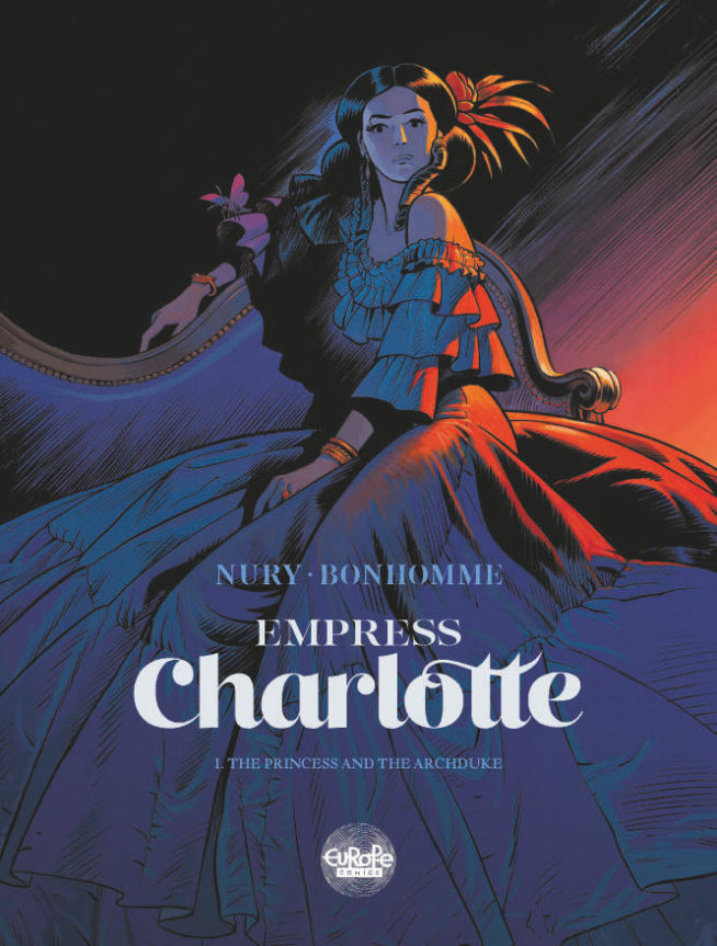
Charlotte Imperatrice (Empress Charlotte), by Fabien Nury, Matthieu Bonhomme, and Isabelle Merlet; Dargaud/Europe Comics, 2018.
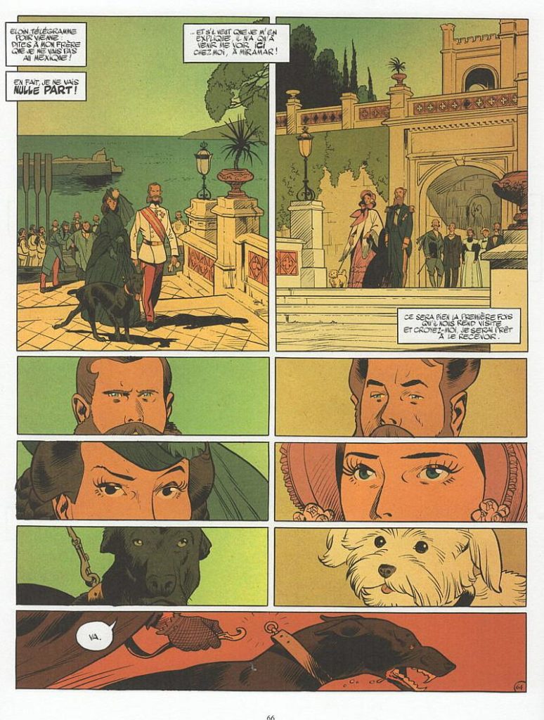
This was one of the guaranteed hitters occupying a place of pride right at the front of every display I saw. A fictionalized recounting of the traumatic life of Empress Carlota of Mexico, it’s the book I saw that I can best imagine making a dent in the US bookstore scene—most likely in an omnibus edition once all the volumes are out. This sweeping costume drama presents a tragic heroine beset by impossible circumstances and the patriarchal structure of the golden age of colonialism, and it slots in equally well to the current US marketplace and *shudder* comics studies courses. Since I can’t actually read any of these books I’m going to focus mostly on how the stories are put across visually, but I will say that Nury’s Carlota seems to be given a broadly sympathetic reading, cast in the type of the “Innocent Maligned.” The book does a superior job of selling what a frosty place the circle of the crowned heads of Europe must have been, and closes right as the real action gets started without feeling like it’s been all or even mostly preamble.
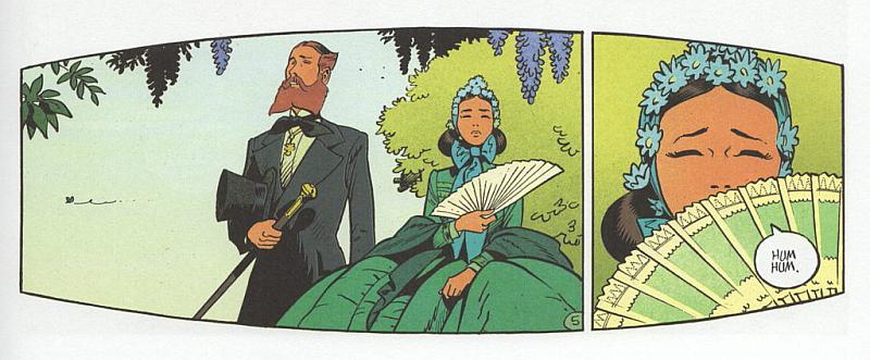
The big hook is the high-gloss visuals provided by Bonhomme and colorist Merlet. Bonhomme’s brushy, airy drafting looks to my American eyes like a more polished version of Moebius when he’s being Jean Giraud for Blueberry. Architectural, sartorial, and floral detailing embellishes naturalistic figures and faces that casually snatch that precious extra mile of expressive simplicity. It’s irreproachable cartooning, but it also feels a whit understuffed. While all Bonhomme’s fine detail work never overwhelms his subjects or compositions, I found myself wishing for a little more grit somewhere on the page. Merlet does her level best to produce the missing je ne sais quoi by adding a speckly textured effect to her flatting. It’s a worthy effort, but it isn’t quite enough. Even the book’s most sordid scenes of degradation in Milanese brothels have a cuteness to them. When Carlota herself is on the page, this tendency increases, giving the Empress a Disney-princess sparkle that her placid, enigmatic real visage held none of. Here, perhaps, Bonhomme’s talent level betrays him—more belabored drawings of his leading lady might have proved to be addition by subtraction.
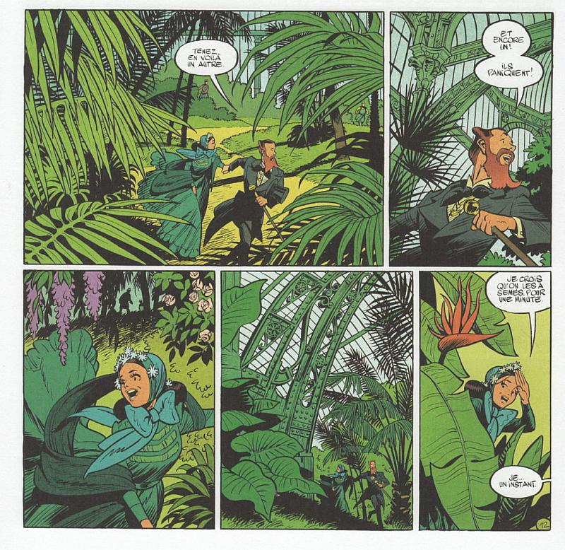
Still, there are big showpiece images and subtle panel transitions in Empress Charlotte that most cartoonists would give their drawing hands to pull off, accompanied by a confident sense of the page as a whole. Just looking at this book, without being able to read a word of it, one never has much doubt as to what’s going on. Bonhomme uses shadow to indicate emotional tenor, sets up animals as visual metaphors, and generally shows an adept understanding of comics as a storytelling medium. The place to really spy his talent is the botanical drawings that fill up the margins of the pages—they’re the liveliest, most expressive work in this book, gorgeous to behold and testifying to great skill.
Colorist Isabelle Merlet comes away with the top honors, giving the book as a whole and each individual scene a distinct color identity, using the classic refrain of the desert-set orange-and-blue Western comic as a launch pad for some very rewarding choices. It’s rare to see unmodeled, flat colors that feel this lush, or a palette that shifts between such high levels of luminosity and gloom. There’s an articulateness to Merlet’s work that most colorists aren’t ever given the chance to display. This book’s visuals are basically what all comics art endeavoring to reach a wide audience should set as its floor: stylish, capable, and extremely pleasant to look at. You can imagine Bonhomme and Merlet illustrating stories in just about any genre or milieu, and carrying them off with grace.
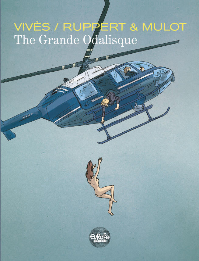
La Grande Odalisque (The Grande Odalisque), by Bastien Vivès, Florent Ruppert, Jérôme Mulot, and Isabelle Merlet; Dupuis Aire Libre collection 2012, Europe Comics 2018.
It’s my pleasure to present Ruppert and Mulot: conceptualizing art-comics major domos in the USA, high flying boob merchants in France. Just this book’s cover was a lightning bolt from a clear blue sky to me. I had no idea Ruppert and Mulot, whose American presence boils down to Barrel of Monkeys, one of the weirdest comics ever to be translated into English, and a single cryptic Kramers contribution, even involved themselves in projects like this. La Grande Odalisque is as truly mainstream as comics get, taking on a genre invented and perfected by Hollywood blockbusters and elbowing into the highest rank of its offerings.
A heist caper starring a badass team of uniquely skilled women, La Grande Odalisque resembles nothing more than a comic book adaptation of the “Fox Force Five” TV show Uma Thurman hitched her Hollywood dreams to in Pulp Fiction. Readers take a whirlwind tour from Paris to the Canary Islands to Mexico and back in the company of Alex, the master thief; Carole, the Olympic-level gymnast; and Sam, the champion motorcyclist, as they rip off famous works of art from France’s most beloved museums, causing property damage and grievous bodily harm in high doses along the way. Seeing such unambiguous entertainment coming from Ruppert and Mulot baffled me; Vivès’ presence makes it a little more explicable, but seriously, picture French director Leos Carax directing one of the Ocean’s movies and you might be able to imagine the trepidation I brought in with me.
Happily, it was unfounded. This book is incredible. La Grande Odalisque’s title page gives no clues as to the nature of Vivès’ collaboration with Ruppert and Mulot, but as he’s mentioned first it’s a logical conclusion that he took the lead on the splashy story, while the forbidding duo contributed their usual highly detailed while still casually scrawled artwork. Ruppert and Mulot usually don’t draw facial features at all—a triangle of a nose or a line for a mouth at maximum—and while they seemingly did most of the work of drawing this thing, there’s a strong flavor of Vivès’ pencils in the French-eyebrowed, manga-eyed leading ladies. Faces only appear on the close-up shots in this book, and Ruppert and Mulot’s art retains all its unique savor through whatever Vivès’ contribution may have been, as well as the superbly understated colors of Isabelle Merlet (her again!). The faceless figures do the espionage-flavored story a good turn, giving its very recognizable, photo-referenced world a dash of surrealism, the feeling that everyone we’re reading about is anonymous or incognito. The dialogue, on the other hand, is frank in the extreme—anonymity or no, there isn’t much disguising our gal pals’ chats on subjects such as orgies sexuelles, sperme hispanique, gros seins, and la meth. The blonde/brunette/redhead combo occasionally reads like Charlie’s Angels parachuted into the middle of Ingmar Bergman’s Persona, refusing to sacrifice a good time on even the most lavish altar of seriousness.
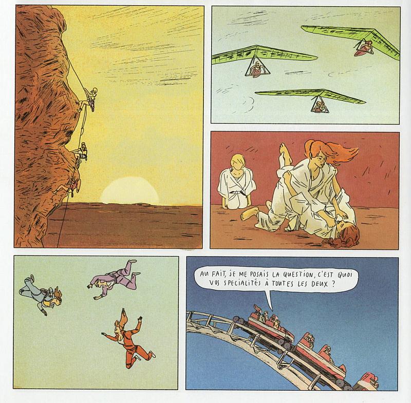
It’s astonishing how well this comic reads across a language barrier. Ruppert and Mulot maintain the classic four-tiered panel structure of album-format French comics, but they aren’t purists—their approach to constructing a page is highly mutable, with strings of smaller, tightly framed pictures suddenly slamming into wide vistas or big multi-figure action shots. It’s unbelievably rare to see a comic that offers action sequences on par with well-done movie scenes in the same vein—such are the drawbacks of a medium of static images. But this! Here there are numerous moments of pure, high-octane impact in La Grande Odalisque that are imagined, led into, and then framed as perfectly as you can do it in any form. We’ve all heard that comics aren’t supposed to be movies on paper, and in a lot of ways this one isn’t—the look of its drawings and its use of its own medium’s unique structure ensure that. But when comics can emulate movies this knowingly and satisfyingly, the argument falters.
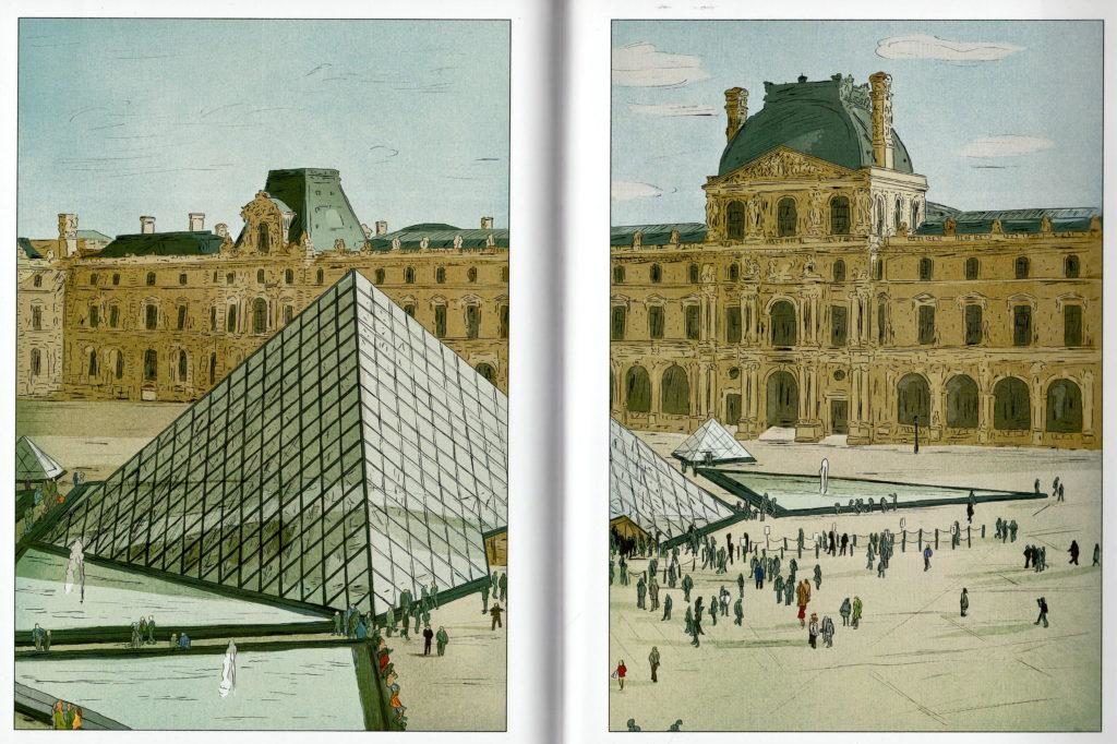
The draw of comics over movies is supposed to be that in comics, free of budgetary concerns, what Picasso said holds true: anything you can imagine becomes real. As computer-generated film imagery doggedly closes the gap between what Jack Kirby could dream up and what can be put on a silver screen, maybe the way to stay relevant isn’t to get more and more outré, but to narrow down to what movies aren’t allowed to do. La Grande Odalisque sets a hugely destructive motorcycle chase in the interior of the Louvre, contains scenes of extreme violence against animals (police dogs, so it’s ok…), and puts its stars through stunt work Tom Cruise would blanch at, including a bouquet of defenestrations and a breathtaking scene of gymnastics on a roller coaster. Vivès and Ruppert and Mulot make you believe in action comics again. Timing this meticulous wedded to set pieces this impactful is simply an impossible combo to resist, even if you’re one of those assholes who thinks comics about fighting are automatically inferior to ones about neuroses.
I also want to single out Merlet’s contributions to this book. They’re undoubtedly subtler here than in Charlotte Imperatrice, but perhaps more important to the work as a whole. With artwork as minimalistic as Ruppert and Mulot’s, providing the weight necessary to bring across the crash and boom of these action sequences is hard without over-modeling everything, and letting the amount of environmental detail they put into their panels come to the fore beneath the hues is just as tricky. Both feats are pulled off with gusto by Merlet, who sculpts with color more than simply filling in, using an impressionistic, airbrushy approach that’s subtle but far from drab.
I want to go on and on about this comic; it’s difficult for me to overstate how impressed I was by it. I really love Ruppert and Mulot’s art comics, but they throw a fastball down the middle that’s just as devastating. Similarly, the Vivès comics we’ve been given in English feel minor when I consider them next to La Grande Odalisque. If I was an editor at Image or Dark Horse or IDW, I’d acquire this thing by any means necessary, serialize it, and then watch the Eisners geyser in. This is genre comics operating with a ridiculous level of competency and style, and looking nothing like anything we have in America while doing so. Material like this gets dollars in the comic shop on Wednesdays, simple as that. You don’t have to take my word for it—the Europe Comics translation is available for download right here. Do yourself a favor!
::: NOTE: I read this book and wrote this critique about it before I read this; I’m not really certain of my opinion, or maybe I don’t have one yet. Still, it seems disingenuous not to append the link to an article praising Vivès. My thoughts on this book’s quality stand. Other thoughts now accompany them. :::
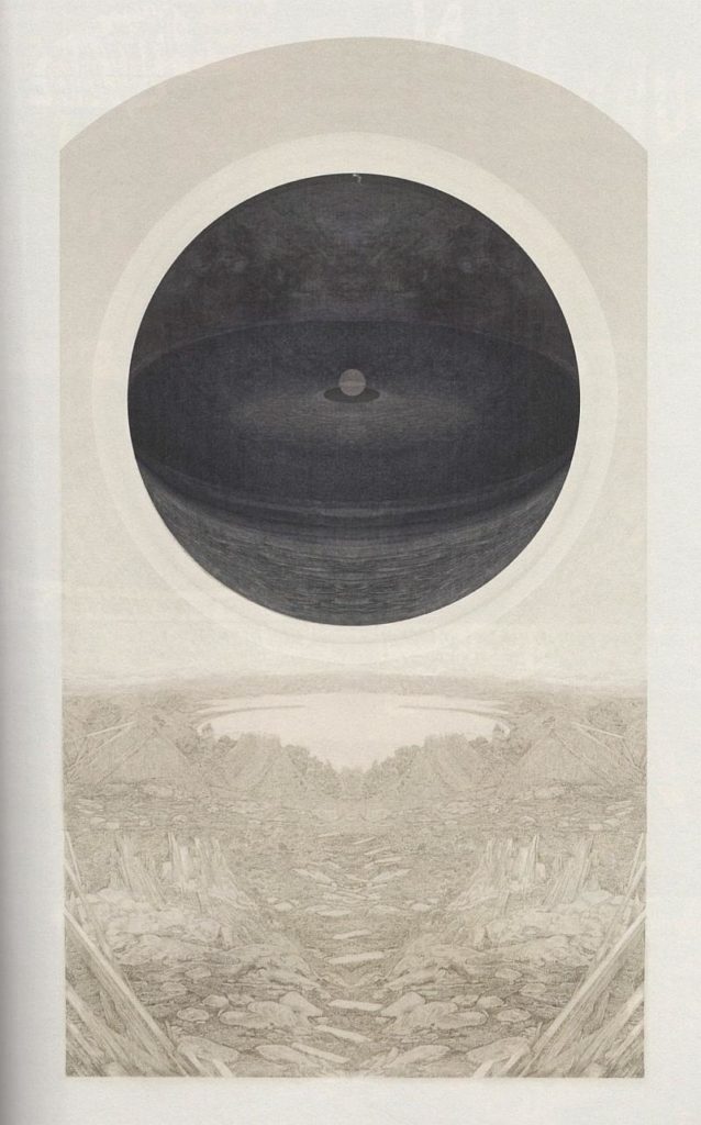
Vie et mort du héros triomphante (The Hero’s Life and Death Triumphant), by Frédéric Coché. Fremok/Bries, 2005.
Not a new book, but new to me. According to the anthology Kramers Ergot, 2005 was prime time for “art comics” in the US, and this book testifies that Europe, though with a few less fireworks, kept pace. Coché’s art, delicate engravings on print block-dirtied paper with visual fuzz as visible as the lines, will inevitably remind American readers of C.F. and Anders Nilsen, but there’s a serious classical drawing facility to his work that neither of those oddballs possesses. The Hero’s Death and Life Triumphant is an abstract, abstracted book. In an interview about it (in French), Coché suggests that the pages were re-assembled to be more “daring” and, it’s implied, make less narrative sense. Still, the work as presented here is powerfully evocative, following the dreams or visions or memories of a weird little monster who looks a lot like one of the Minions.
Our hero rarely appears in the anecdotes that spiral from his consciousness as he lies abed in the palace of his adoptive father, a king who occasionally lies next to him, sleeping or dead. Instead, these tales focus in on the follies of the medieval world, with splendid knightly legions decimated again and again by disease, war, and beasts of the woods. The perils of biology are an especially prominent theme, with worms slithering everywhere and cutaway views of people’s innards wracked by contagion frequently hovering over their heads like word balloons. Something that this book does not in fact employ, but the verbiage of the chapter titles (“Amendment Cartouche: Why it Turns Out that Father Can Offer Naught but Geometry (The Pursuit II)”; “Pedestal Painting: Concealing Medusae”) imparts literary weight to the doomed meanderings we follow to their black conclusions. If you want the comics equivalent of an experimental metal album, here it is, complete with drawings that could provide endless badass album covers.
For a comic without any words, Coché’s artwork is naturally the main attraction. Once you get past just how similar it looks to the cutting-edge American comics of its time, the more individualized facets of his approach come through and are something to savor. His way with negative space is incredibly striking—time and again, what is fundamentally a detail-rich drawing style slams up against a compositional sense obsessed with visualizing only what’s necessary. The blank spaces on these pages make as bold a statement as Coché’s linework does, forcing the reader to scrutinize his images rather than simply looking at them. Figures in backgrounds are silhouetted rather than rendered, and wide vistas drawn with great elegance give way to crude doodles without warning. For someone who can make such pretty pictures, Coché’s ability to edit himself is downright ruthless, and it makes for very striking imagery.
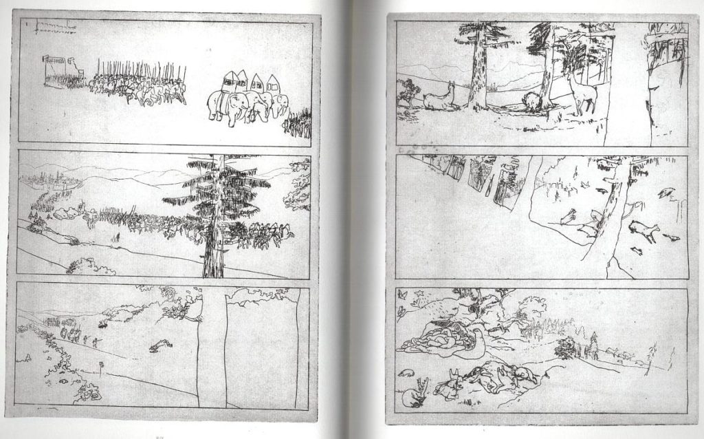
The blank spaces left in the story are more bothersome—there’s no shortage of ideas on the pages, but Coche’s presentation of them is so cryptic it borders on the inaccessible. Many of the vignettes The Hero’s Life and Death Triumphant presents are simply difficult to parse, clearly possessed of meaning but uncommunicative. This isn’t the worst thing in the world—backed by artwork this accomplished they still carry a powerful vibe. But the book’s best sequences do speak, if primarily in tongues. A panoramic nautical battle illustrated in splash pages concludes with its desperate survivors’ discovery of a ruined temple on a jungle island, as sinister inset panels of Roman columns and Indian gods hang over everything. A magisterial Renaissance-drag take on the Circe section of The Odyssey sees its protagonists rowing up a very un-Mediterranean river, their muskets blowing the brains from a herd of fording elk. And a history-collapsing apocalyptic conclusion hints at how much more to it all there could have been. This book is highly accomplished as both enigma and saga; I just wish it could have figured out which it really wants to be.
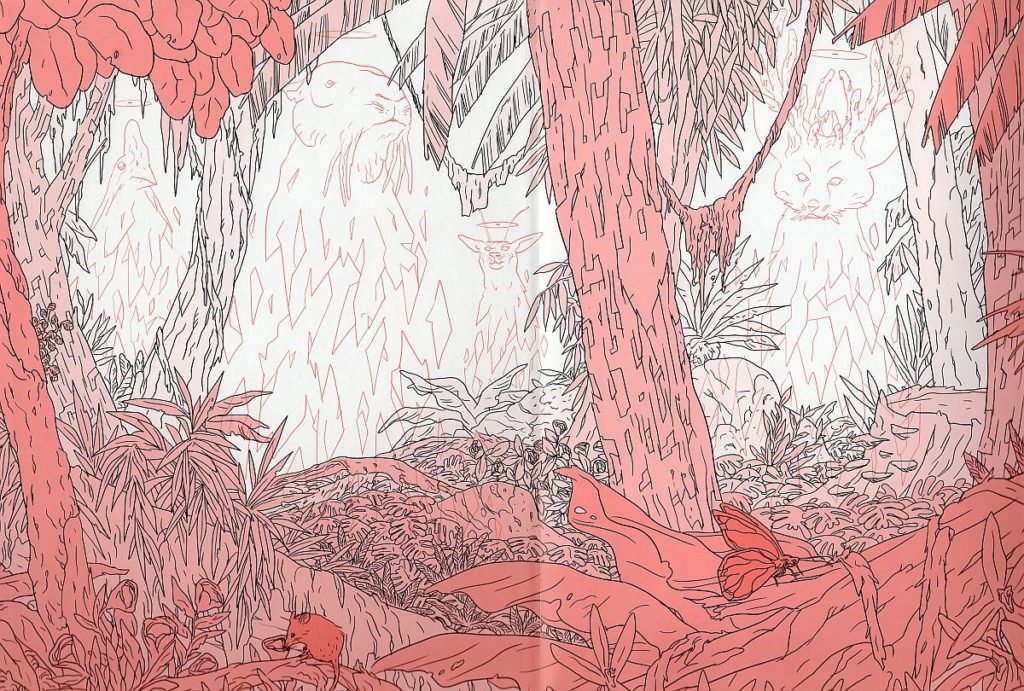
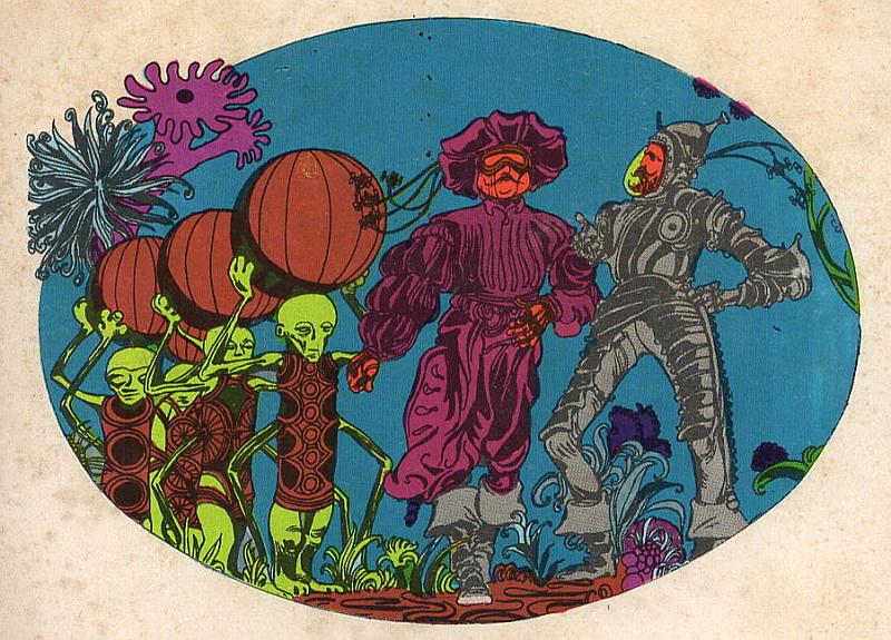
Poussière vol. 1, by Geoffroy Monde. Delcourt, June 2018.
I know nothing about Geoffroy Monde, but holy cow can this dude ever draw! Poussière had me from the endpapers (above). Unlike with Ruppert and Mulot, this comic is pretty difficult to ascertain the specifics of without being able to read the words. A lot of that is owing to its fantasy genre, and the fact that it throws you right into the middle of the action while explaining itself as it goes along—at least it seems that way from the fully stuffed word balloons on the first few pages. From what I can figure out, Poussière is a pretty blatant rip-off of Attack on Titan, with an archaic but militarily advanced society trying desperately to fend off incursions by towering humanoid beings. Looking over the events this book chronicles feels a little like watching the American version of the original Godzilla: a version of something rather than a wholly original work, the similarities are just so noticeable. But hey, the Attack on Titan guy can’t really draw, and there’s enough visual muscle flexing on these pages to overpower the defects in any script—or lack thereof. Alan Moore could write for Monde and the pictures would still be the first thing you’d notice.
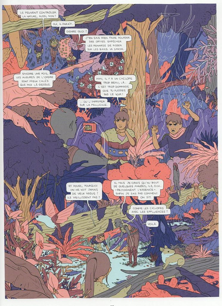
Monde’s drawings have a heavy shonen manga influence, but the visual experience of Poussière doesn’t resemble manga or anime as much as it does one of those Japanese “art of” books full of background paintings and buffed out, hand-colored presentation drawings. The panel compositions and character designs on display here have a world-building sweep that it’s rare to see in any kind of comic—this must have taken forever to draw. Monde’s forms are deceptively simple, with the colors carrying a ton of the illustrative load. I almost want to call this book ligne claire manga—there are no line weights or black areas, but a strong sense of light and shade nonetheless, thanks to expertly chosen flats and rendering colors that show just as deft a touch as the drafting does. The “perfect sunset” sought but never achieved by Marvel editorial in their books’ coloring is on full display here, and it’s glorious. These are pages you can lose track of time inside, picking out spare details and admiring the way they’re laid down.
Style isn’t everything for Monde, however: the content of these pictures is often as interesting as the way they’re drawn. Poussière teems with body modifications and prosthetics. One character sports a full-body flower garden tattoo that slithers up to her jawline, turning her into the most elegantly bearded lady I’ve ever seen; another’s body seems to be half made out of statuary; a third has completely transparent hands and forearms, visualized à la Jack Kirby’s Invisible Girl. Scarification also abounds; a sequence of a back-alley beggar slicing away thin strips of his hands is indelible. So is the big action climax’s tragic fallout, with a little kid getting ripped to pieces in a sequence that’s more affecting than any of Titan‘s violent scenes because of how elegantly limned it is.
The Titans, I mean “Cyclopes,” that function as Poussière‘s silent antagonists are drawn without any holding lines, crystalline beings of pure color, spectacular rhyming shards of pink and aqua beaten together into figures. Monde further satisfies his impulse to draw with color in scenes of dream, memory, and unconsciousness, assembling gloopy blobs of jewel tones into soft-focus tableaux that don’t quite look like anything else out there at the moment. (A more technically accomplished version of Jesse Moynihan’s Forming is as good an approximation as any.) The last of the book’s color-only scenes resolves into an intriguing plot twist that seems destined to pull Poussière and Monde away from the Titan riff and toward our own reality in future volumes, most likely kicking and screaming. Here’s hoping a scene of somebody watching their favorite giant-zombie anime shows up in the next book! I’m aware that I might be lavishing a lot of high praise on the European version of an Image comic—nice-looking genre material with a few twists that are designed to put it head and shoulders above its competition but really just save it from being 100% derivative. But the visual craft and rigor that Monde has put into imagining his world, no matter how many times we’ve seen something that looks like it before, are worthy of being singled out.
Scratches 1, ed. Joost Swarte and Hansje Joustre. Scratch Books, October 2016.
Finally, a book I can read! Scratches is Joost Swarte’s go at sitting in the Spiegelman chair, manning an anthology that covets a crown to complement the one its editor has earned with his own work. From the minimalistic photo cover on in, Scratches aims at being the comic book version of one of those expensive magazines you see on the top rack at the bookstore. Artforum for comics, but with less ads? That sounds lame, but it’s a fairly shrewd attempt to identify and fill a gap in the market. Raw, where Swarte was introduced to American audiences, was a swing at the same thing, albeit grounded in a time and place where the art world it had pretensions to was a tad more accessible than it is today.
Still, Scratches exudes a vibe that, really, none of comics’ big deal anthologies have ever quite nailed—that of the coffee table book. Kramers, Weirdo, Decadence… it seems like all the great anthologies, whether due to their presentation or their content, demand a large amount of time and focus. Scratches, by comparison, is as utilitarian as one of the fancy design periodicals it’s dressed as—you can pick it up, open it at random, read a page or two, and put it down satisfied. Or, alternatively, continue. In its Penguin-published second volume, Raw flirted with this feeling, but much of the work it ran was far too intense to be consumed casually. This book wears its confectionery status as a point of pride. Swarte smartly keeps the strips in Scratches short—the longest is wordless and tops out at eight pages, but few run past one spread—and most carry some kind of a punchline. With the inclusion of a few graphics-heavy articles, the impression at times is of reading a ridiculously overstuffed, evolved version of a Sunday funnies section—an ignored turn on the road that led us somehow from Winsor McCay and Lyonel Feininger to Garfield and the Family Circus.
The strips are a mix of quick blasts from established/overexposed masters—Chris Ware does the back cover, Spiegelman hacks out a few doodles, and yeah, of course Crumb is here—but their work gains vitality when slipped in among a contributor list of less familiar names, the most vaunted among whom undersell for D&Q once in a blue moon. Maybe the context that Bendik Kaltenborn and Brecht Vandenbroucke miss in solo presentations of their work is right here, as Swarte musters a gang of younger Dutch and Belgian cartoonists into a compelling case for Low Country comics having an identifiable regional flavor. Deadpan, non-sequitur humor predominates, as do proficient drafting and a flair for visual invention. Swarte’s own strip is a gem, but there’s work in Scratches that shines just as brightly while building a subtle case for its editor’s influence among his lowland juniors. Milan Hulsing’s story begins as a compelling slice of jazz-fusion history before corkscrewing itself into a “black version” of 2001: A Space Odyssey. Sam Vanallemeersch exhibits his all-too-infrequently published drawing in a brightly colored bit of nonsense that begs to be pored over whenever the book is reopened. Guido van Driel captures the strange sense of inevitability that pervades alien abduction testimonials in a po-faced retelling of a ’70s close encounter.
Scratches is full of strips that would feel odd in just about any other book of comics, but together they cohere into something whose very randomness gives it a concrete identity. Not everything in the book is great, of course—it has most Continental anthologies’ tendency to privilege wordless formal exercises that go nowhere—but pound for pound it’s an impressive package, a considerable offering of new European talent to the English-language market. The articles, by the way, are just as good as any of the comics in the book—they made me pine a bit for the late, lamented Comic Art magazine. First among equals is Evert Geradts’s profusely illustrated remembrance of his friend Mark Smeets (the most overdue-for-translation cartoonist Europe has left), which provides a fascinating peek into a truly unique creative mind and provides a sunny corrective to Chris Ware’s melancholy Kramers profile of the ligne claire oddball. Scratches released a second issue this year, and if anything, it’s an improvement on the first. One to watch.
::: BONUS ITALIANATE SELECTION :::
L’astronave pirata, by Guido Crepax. Savelli Editori, July 1980.
Not new and not French, but who cares! The whole point of this is showing you cool stuff, so behold: a Guido Crepax comic I’d never even heard existed. Drawn in 1967 and reprinted at pocket-novel size, this slightly archaic-feeling cosmic adventure illuminates a fascinating path explored but left untraversed by Crepax early in his career. Created contemporaneously with the first outings of Neutron, the super-espionage strip that mutated into Crepax’s career-defining opus Valentina, L’astronave pirata is a glimpse of the cartoonist its author could have become had he chosen a more typical career instead of pursuing themes of sex, power exchange, and the Gothic to their end points. It’s Crepax as red-meat mainstream cartoonist, giving the people what they want.
Not that Neutron isn’t that, exactly, but knowledge of what it eventually became colors one’s reading of it. Equally notable as what’s on the pages of L’astronave pirata is what’s missing when you compare it to its more famous cousin. The panels maintain a gridded structure instead of splintering and fragmenting at fraught moments. Extreme close-ups and multiple-ground shots barely appear, with most panels presenting full figures beneath the invisible proscenium arch of classic newspaper comics. Sequences of tension don’t freeze in amber and stretch out diagrammatically for pages the way they do when Valentina’s in them, but proceed at more or less the usual speed. Basically, this is a normal comic. But Guido Crepax sure didn’t draw many of those, which makes it a curio worth unpacking.
I’ve always seen a very strong similarity between Neutron and the pop-art leaning Marvel comics that were coming out simultaneously in America. Jim Steranko’s classic run on SHIELD is pretty much swiped lock stock and barrel from Crepax, whether consciously or not. L’astronave pirata, funnily enough, is downright redolent with the flavor of 1960s DC comics—the slightly staid and fusty ones that never caught the New Wave of sci-fi, illustrated with calm ad-art professionalism by guys like Murphy Anderson, Mike Sekowsky, and Carmine Infantino. Crepax’s personal aesthetic gels oddly if compellingly with that of the space age, where Wally Wood bubble helmets distend into shapes that look like the proboscises of giant, glittering insects and space suits rendered to look like Renaissance parade armor. This has got to be the most baroque space comic of all time; the zero-gravity setting makes the whole book look like a long, expertly choreographed ballet.
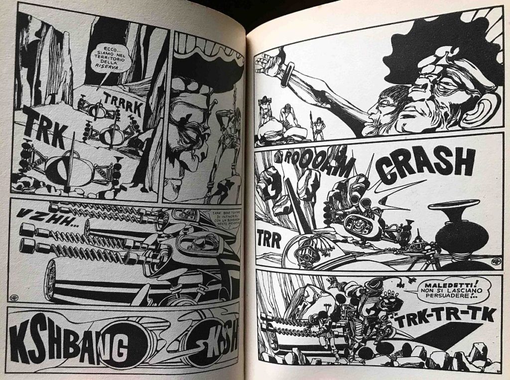
The purest pleasure on offer here is just looking at panel after beautifully put together panel of Crepax’s early, brush-heavy chiaroscuro style, which I’m more fond of personally than his gossamer pen-embellished mature art. Crepax’s ability to assemble areas of black and white into perfectly balanced compositions was frankly stunning. The way his marks interact with one another on the page has more immediate vitality than most artists’ fight scenes. If anything, it looks even better shrunken down to this size. Unfocus your eyes just a bit to take in the way the shapes and lines talk amongst themselves and you’re looking at some pretty outstanding abstract drawing. Harsh angles and geometric shapes rendered all in black are entangled and abutted by whirls of twisting line, meticulous patterning giving way to bold graphic simplicity, often in the same panel. Crepax’s wide-ranging visual imagination goes much further afield than his content does, dreaming up spaceships that look like fantastic seashells, a tribe of women clad as giant butterflies, and extremely novel ways to depict water in an ink-drenched subaqueous sequence that resembles its creator’s later work more closely than anything else here. This is the kind of comic I’m almost glad I can’t read; as spacefaring adventure I’m sure it’s solid, but as something exotic and unknowable it intoxicates.
The opinions expressed in this article are solely those of the writer, and do not necessarily represent the views of Europe Comics.
Originally published on The Comics Journal. Matt Seneca can be found at mattseneca.tumblr.com.
Header image: Empress Charlotte © Nury & Bonhomme / Dargaud